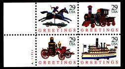
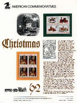
29¢ TOY TRAINContemporary Christmas Issue - October 22,
1992
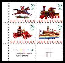
The Contemporary (or secular) Christmas Issue for 1992 echoed that of 1970, with four
antique toys. The train and horse were repeat themes, while the fire engine and boat
here replaced a doll carriage with doll and a mechanical tricycle. Reflecting the change
in times, this issue was released in three different formats - a pane of 50, a booklet
with five panes of four, and an ATM sheetlet of 18.

Sc. 2712 - issued 10/22/92
|
|

Sc. 2714a - issued 10/22/92
|
|
The pane was one of the first US issues produced using offset lithography, and included
special security design elements to deter counterfeiting. None is clearly visible on my
scans, as my scanner cannot produce enough detail to show them, but each stamp includes
the year, 1992, in microprinting, and each has a small triangular area of the design
filled with a super-fine pattern of magenta dots. Click on the single at left above to
see the enlarged version and you might just make out a dark area in the red trim above
the white showing through above the top spoke of the large spoked wheel on the far side
of the train - that's the date. The magenta area is the triangular opening at the bottom
of that same back wheel, and on my screen does look pinker than the other openings.
The article on this issue in the 1992 Linn's U.S. Stamp Yearbook says that
the artist copied the toy train shown from a picture in a book, but then forgot which
book he used. Can you identify the toy?

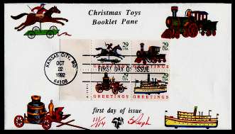
Sc. 2714a FDC - unknown maker
|
|
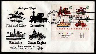
The cachet on this FDC is undistinguished - it merely echoes the stamp designs - but it
does credit the designer, which I approve, and the stamps used are a corner block with
plate number and plate diagram, a nice philatelic touch.
|
|

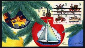
Sc. 2714a Kendal Bevil Hand painted FDC
|
|
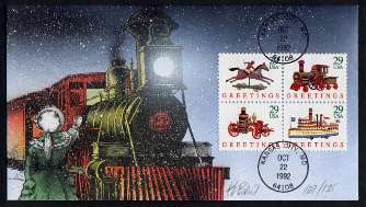
The cachet is everything here, and while I could criticize it for lack of relevance -
the train on the stamp is a toy, and if its design was based on an actual engine, it
bears no resemblance to the one in the cachet - still it's a beautifully executed,
evocative bit of art work.
|
|

Sc. 2716 - issued 10/22/92
|
|

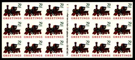
Sc. 2718a - issued 10/22/92
|

Sc. 2718a booklet cover
|
|
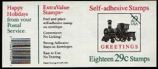
The booklet version was produced using gravure, which supposedly is harder to reproduce
convincingly, so required none of the special microprinting and other security measures
used for the pane version. The easiest way to tell them apart is by the perforations -
2712 has perfs on all four sides, while 2716 always has the same two straight edges.

Sc. 2718a Pugh FDC
|
|
This Pugh FDC simply echoes the designs, but in color at least. And it uses a full
pane, with plate number. I like the arrangement, too - why leave space for an address,
when actually using one would cut the value of the item in half?
|
|

Sc. 2718a Tonya Dwojachi hand painted FDC
|
|
Here again, the cachet is everything.
|
|
This was not the first ATM pane of stamps, but it was the first Christmas issue on an
ATM pane. The train design was judged the best for this application - the design had to
be distorted, and this one held up better than any of the others. Its total lack of
perfs makes this one easy to spot. I scanned all three of the singles shown here (2712,
2716, and 2719) at the same time (i.e., at the same resolution), so if you open the
high-res versions of all three and
size their windows so you can see all three at once you can see the other differences, in size,
paper, and ink colors, at least in relative terms.
ATM stamp panes were an impressive technical accomplishment, since each pane had to
be close enough to the size, thickness, and "feel" of a twenty-dollar bill to be
dispensed reliably by ATM machines. Like many modern accomplishments, they remind me of
Max Born's description of the first moon landing - "A triumph of the intellect, but a
tragic failure of reason".

Sc. 2719 FDC
|
|

Sc. 2719 FDC
|
|
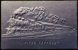
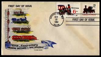
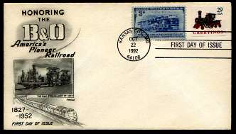
The two covers above have an appealing philatelic element, the use of older stamps and
covers with a tie-in to the new issue, though the aging on the one is a detriment.
However, either the person who created them (I suspect both are by the same anonymous
maker) requested the wrong first day cancel (my guess), or the clerk processing them used
the wrong one. The ATM sheetlet was NOT issued at the same time as its brothers.
Instead the USPS chose to release it at the ASDA Fall Postage Stamp Mega-Event in NYC.
The wrong date might enhance their value to someone (the dealer I bought them from had
written "Date Error!" on the label), but to me they are simply oddities.

Sc. 2719 Bernard Goldberg FDC
|
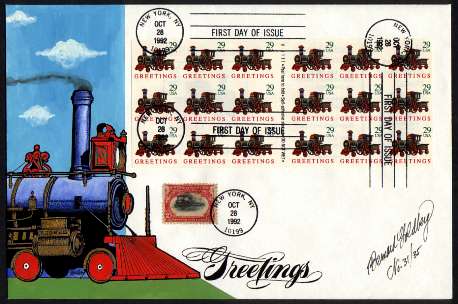
Here, on the other hand, is a great FDC, with a magnificent cachet, and all the
philatelic value one could ask - not only a full pane of the stamps (no, it wasn't placed
stamp-by-stamp, the backing is there, and the super-thinness of the ATM format makes that
quite workable), but a nice copy of Scott 295 tied to the cover with a first-day date
stamp. The creator was Bernard Goldberg, whom I had never heard of before seeing this
item. He used thermography for the black design elements, tempera (I think) for the dark
solid colors, and water color for the shaded areas.
This issue seemed to inspire FDC makers, as it was a challenge selecting only the ones
above to include here - I had eight or ten others I wanted to show, but felt that was too
many, and that it was only their graphic appeal that recommended them, whereas I have
already established standards above, and should follow them; so I chose items with at
least the pretense of philatelic value as well.
|


