|
<<<< |

|
>>>> |

|

TRAINS ON U. S. STAMPS
and POSTAL STATIONERY
page 5a

Embossed postcard with train image - 20th Century Limited |
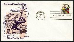
10¢ ZIP CODE ISSUE - January 4, 1974
The train on this stamp could be described as a "streamlined locomotive and cars", but since the design is simply a cartoon (or what was called at the time "Pop Art"), I prefer simply "cartoon train". The stamp was one of the early USPS efforts to persuade the public to use ZIP codes on mail, and shows some of the types of vehicles used to move the mail - planes, trains, and trucks. USPS publicity for this stamp said:
It is odd they showed a train on this stamp, since according to the USPS web site:
I suppose showing a train here was a tribute to the trains' history with the USPS. ZIP stands for Zone Improvement Plan, the five-digit national coding system introduced by the USPS in 1963 to speed mail processing. It replaced the earlier system of zone numbers, initiated in 1943 in major cities - I remember writing to addresses such as New York 10, New York, when I was a kid. Smaller cities had no zones. In the ZIP code, the first digit identifies a major geographic area; the second indicates a more specific area, such as an entire state; the third indicates an area such as a major city; and the fourth and fifth digits identify a delivery station or town. In 1983, the system was expanded to ZIP+4, with four more digits added to designate a specific apartment building or even a single house or post office box.
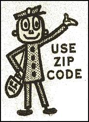
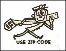
ZIP codes are still not mandatory on ordinary first-class mail (USPS DMM A010.1.2e), though most people now think they are and use them; but 1974, when the program was only ten years old, only about 80% of all mail carried the ZIP code, and this stamp was part of the USPS effort to get the public to use it more. Another tool in the campaign was the "Mr. ZIP" figure printed in the selvage of sheets of stamps (and used widely in postal advertising) from 1964 to 1986. Don't know the proper ZIP code for an address? Here is the USPS web page that will tell you: http://www.usps.com/zip4/. The designer of this stamp was Randall McDougall. It was printed by photogravure. Almost 717 million copies were printed, so it is still plentiful today, and available in full sheets at face value. There is one major color error:
I do not usually pursue errors and varieties, but this one appealed to me for some reason, and the price seemed reasonable, so I own it. It is Scott 1511a, the yellow omitted error. It catalogs $50. Over a thousand copies exist, but there are dangerous fakes as well, so buy with caution.. For starters, compare a supposed error with a normal stamp. Examine both under at least 16x magnification, looking carefully at the areas that are yellow or green on the normal stamp. You should see white or blue. If anything looks faded or blurred compared to the normal stamp, or there are any traces of yellow or green, the "error" is a fake or color changeling. For maximum security, have the stamp authenticated by the Philatelic Foundation or American Philatelic Society. Scott lists a pair "with full horizontal gutter between", with no price, indicating it is probably unique, and has not sold publicly, so no price can be established. No other perforation errors or varieties are known.
FIRST DAY COVERS
As a definitive, this stamp got short shrift from the FDC makers - I have seen none that was more than minimal. The Fleetwood cover above is typical, and lacks their usual well-researched and informative text on the back, which in itself says a lot.
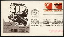
This cover is a little more interesting. It's a FDC for Scott 1518a, issued 10/2/1974, apparently in conjunction with the National Postal Forum, a periodic trade show held since 1968 for the mailing industry. The cachet on the cover is the design of Scott 1511, while the stamps are the new bulk-rate issue, which would be of some interest to NPF attendees. There is a lot going on on this cover, with two versions of the stamp, cancelled on the first day of the precancelled version, and presumably handed out at the A B Dick booth at the show, to demonstrate their new bar code technology. I wonder if the show's slogan that year was the ZIP code stamp's text - "It all depends on ZIP code." The show's attendees were certainly a major target of that message.
|
|||
10¢ TRAINS - POSTAL SERVICE BICENTENNIAL ISSUE
|
|||

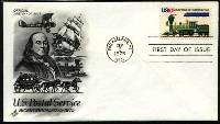
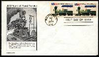
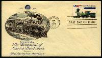
Sc. 1573 - issued 9/3/75 |
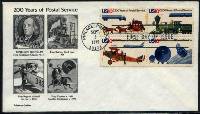
This stamp is part of a setenant block of four, shown below, issued to celebrate the 200th anniversary of the establishment of the independent postal service in the United States, dating from the July 26, 1775 appointment by the Continental Congress, of Benjamin Franklin as Postmaster General of the united colonies. Three of the stamps show old and new methods of transporting mail - a horse-drawn coach vs. a modern truck, an early biplane vs. a modern jet, an old 4-4-0 steam engine vs. a modern diesel streamliner; while the fourth shows telecommunication satellites in space. Even in 1975, little U.S. mail moved by train any more, but the tribute to the place of trains in the evolution of mail delivery in this country was fitting.
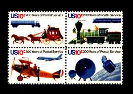
Sc. 1572-75 - issued 9/3/75 |
According to USPS publicity for this stamp:
On July 26, the anniversary of the date in 1775 when Benjamin Franklin was appointed Postmaster General by the Continental Congress, the designs of the stamps were unveiled in connection with the opening of the B. Free Franklin Post Office. This new post office in the restored Franklin Court complex in Philadelphia, is named after the franking technique used by Franklin, who used the word "Free" between his first initial and his surname.
The 4-4-0 shown on the stamp is detailed enough that one might be able to identify it as a specific locomotive. The closest I have been able to find is a Baldwin narrow-gauge, the Eureka & Palisades No. 4, built in 1875, and shown here, though it looks to me like the stamps's artist symplified the train's design quite a bit. That's what they mean by "artistic license," I guess. The key features of this locomotive to me are the smokestack, typical of wood and coal burners of the 1850's through the 1870's, and the small size of its driving wheels. On most 4-4-0's they are much larger.
The modern streamlined diesel engine looks like a GM EMD F-series Bo-Bo (though the space between the bogies should not be so empty), with unknown livery. I think this too was intended to be somewhat generic.
Can anyone identify either locomotive more accurately? Write the webmaster at posterstampcc@gmail.com
These stamps were designed by James L Womer, and printed by gravure. Over 168 million copies were printed, making them still relatively plentiful in mint condition.
MISSING COLOR ERROR
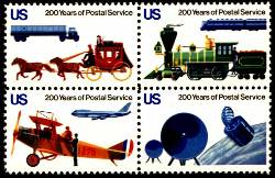
Scott 1575b - Red (denomination) omitted
There is one known error, red (10¢ denomination) omitted. Two plates were used for the red, one for design elements, the other for the denomination - only the denomination is missing. Catalogue value for a block of four is $9,500. Only four error blocks have been reported, implying that only a partial sheet was affected.
FIRST DAY COVERS
None of these strikes me as noteworthy, they're all just representative of the ones I own for this stamp - nothing wrong with them, just nothing special.
US TRAINS
|
Send feedback to the webmaster: CLICK HERE
Revised -- 11/18/2004

