
A is for Advertising Collar |
 |
 |
 |
 |
Click on any image below to view a high-res version
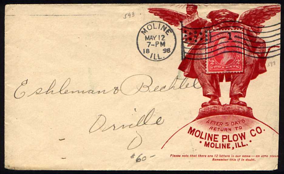
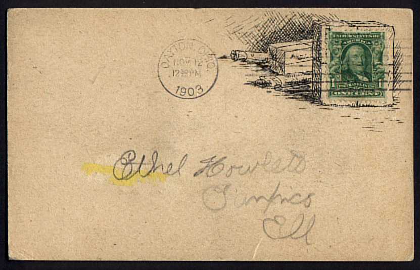
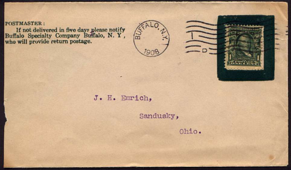
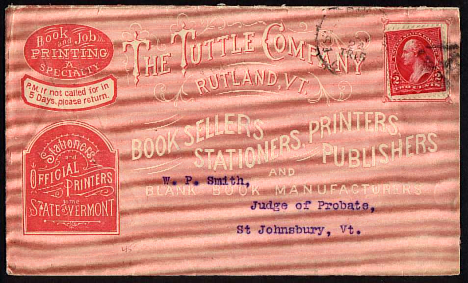
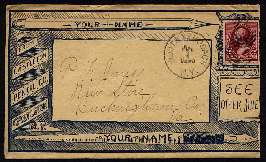
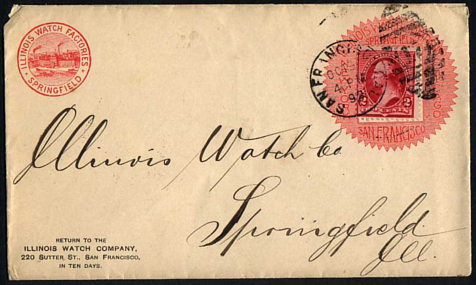
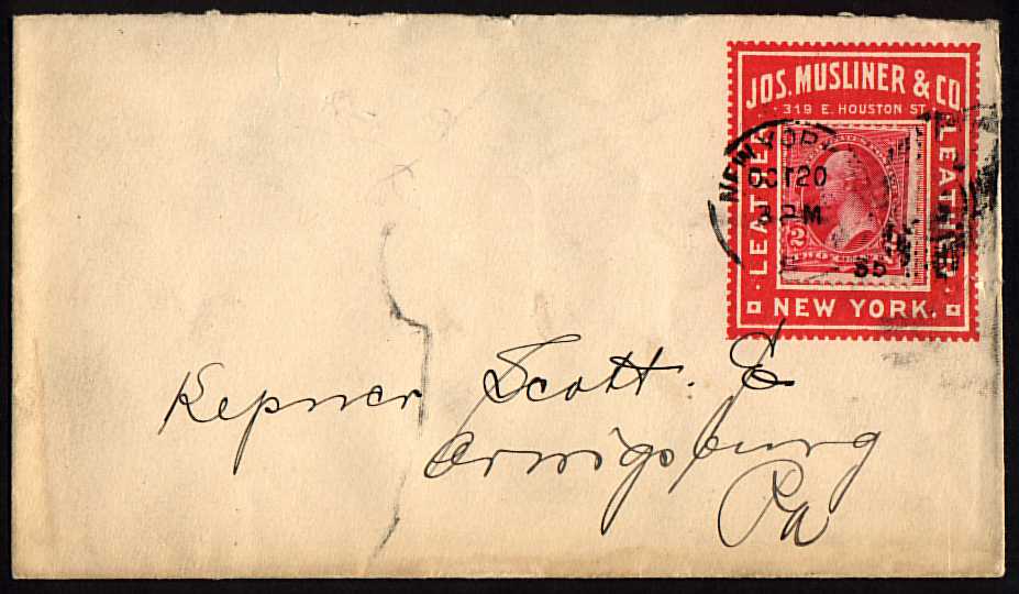
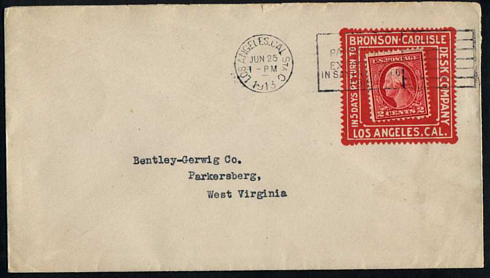
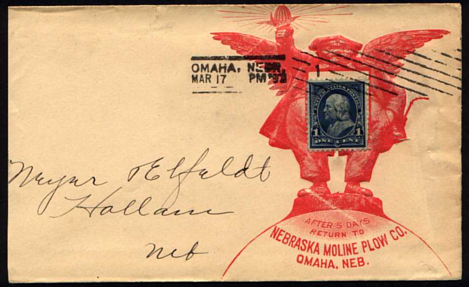
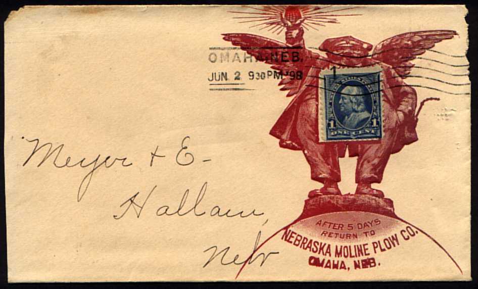
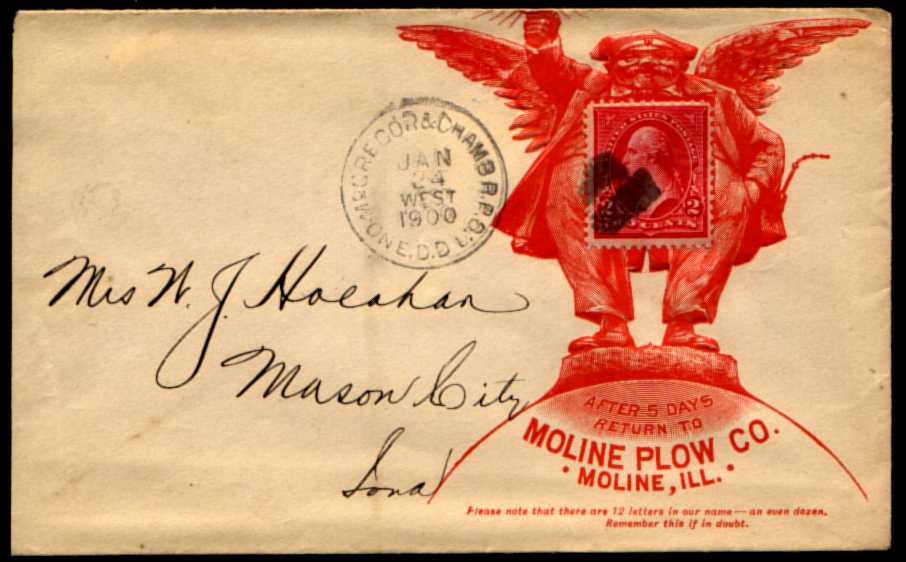
The number of different advertising covers out there is formidable, and many collectors specialize in a specific type, such as Advertising Collars, on which the design was intended to frame the stamp. These are not as common as one might suppose, perhaps because they don't work well unless the stamp is perfectly placed. It may also be that they were outlawed by the Post Office at some point, at least I have this vague memory of reading that somewhere. The cover above, a popular design from the Moline Plow Co., is a personal favorite and one of the most striking of the stamp collars. It can be found in several different versions (see below). This one is an early one, dated 1899.
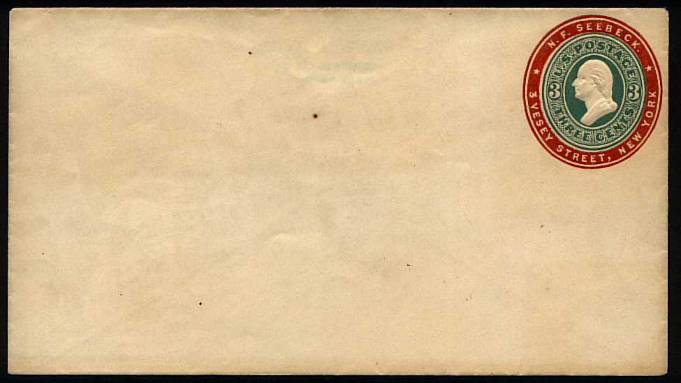
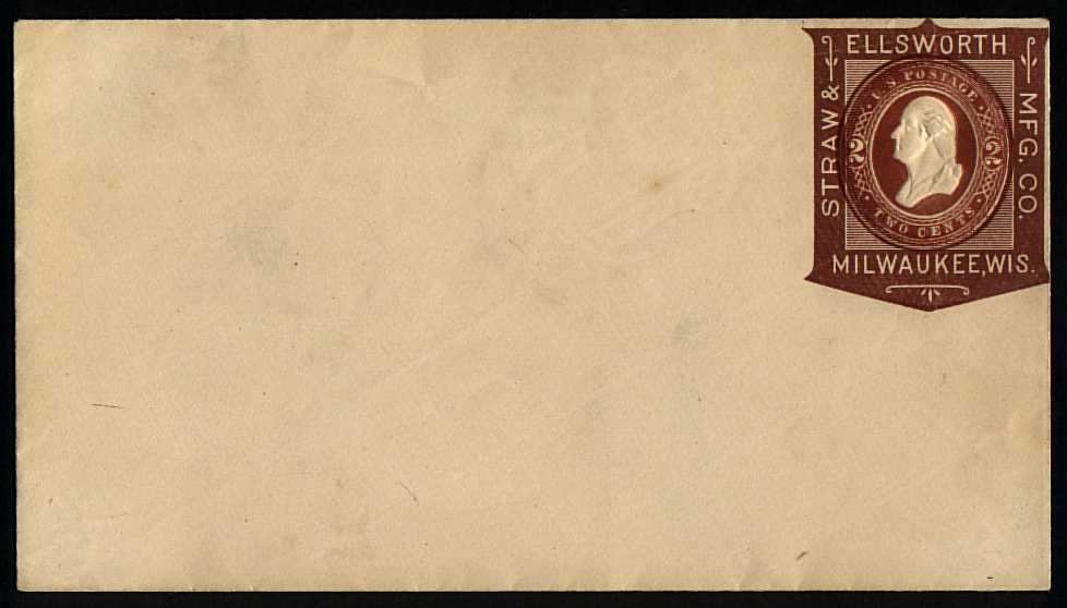
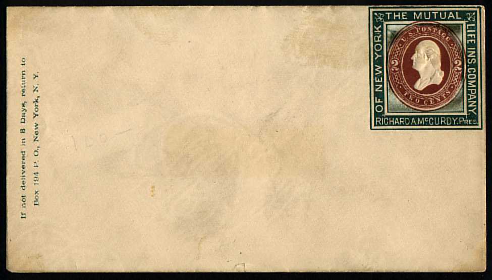
Some advertising collars were printed on postal stationery. The advertising was printed by the same firm that produced the envelopes, and at the same time, which obviously circumvented the difficulty of centering the postage in the collar, and allowed an integrated design that combines the "stamp" and collar in an artistic, attractive fashion. The three above all date from about 1885. Note that these are mint entires - most advertising covers are collected used, since that is the only way they are found. How did these come to be available mint? Their price - $250 each! - implies they are not common thus.
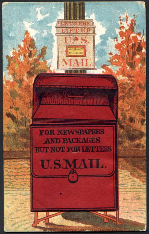
Below is a POSTCARD with a decorative (rather than advertising) stamp collar, and a mailbox on the picture side. It dates from the early years of postcards, when the address side could contain ONLY the address (it was 1907 before messages were permitted on the address side of postcards), so the red mailbox on this one has a hinged flap, and beneath that is a little pocket into which a small piece of paper with a message could be slipped. Mine has lost its enclosure, but is still a treasured part of my collection, both for its collar and for its clever device.
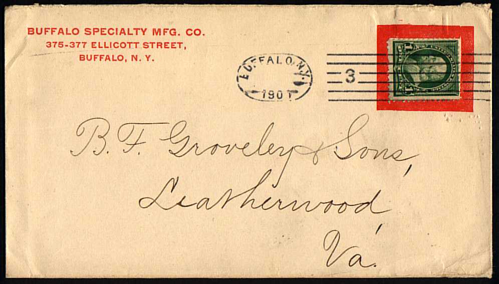
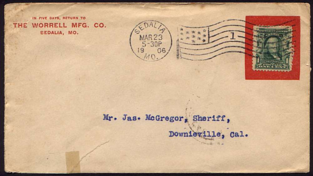
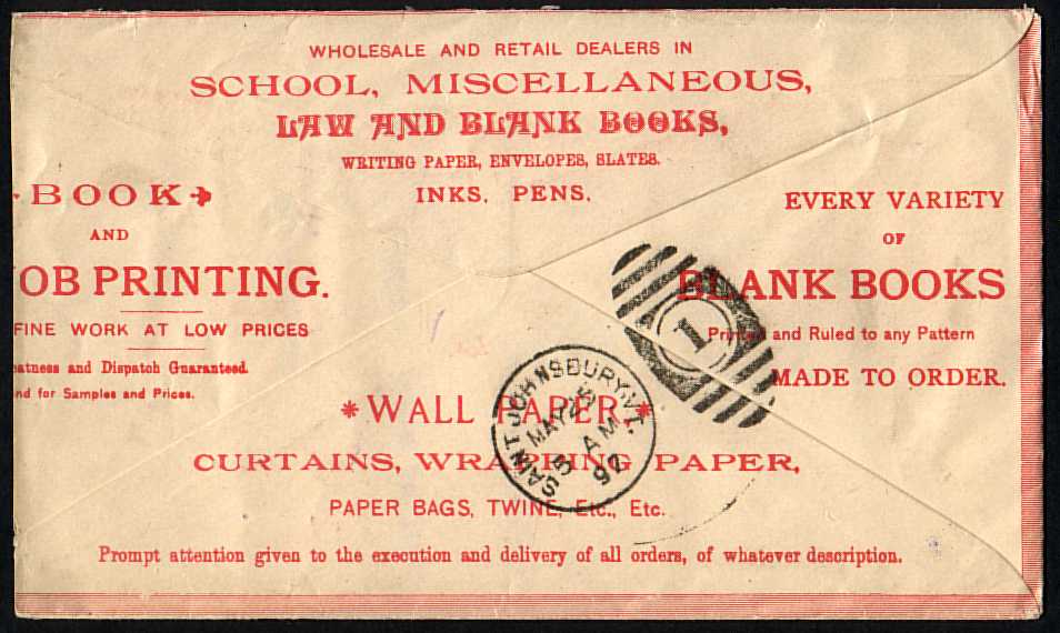
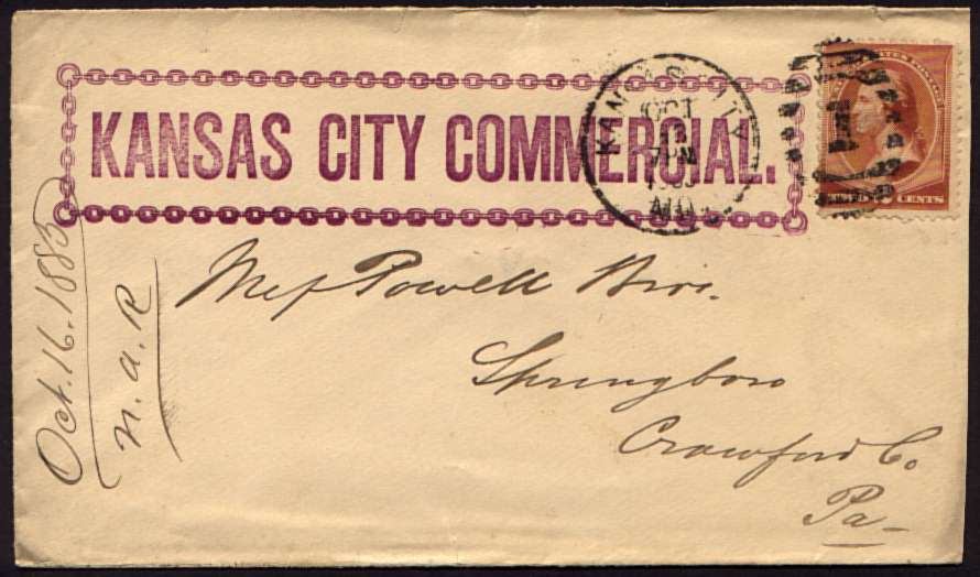
Below is an assortment of advertising collar covers, including my favorites, and some oddities.
These first three are the simplest collars I own, and if this were as far as anyone had taken the concept, I would not collect them - these are pretty boring. The first one illustrates one limitation of the form, though. The collar was created for a horizontal- format stamp, so this vertical one had to be turned sideways to fit.
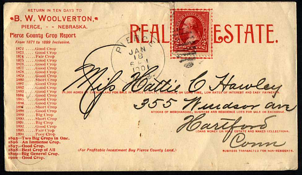
The next two have some interesting content on the back, so I show that as well.
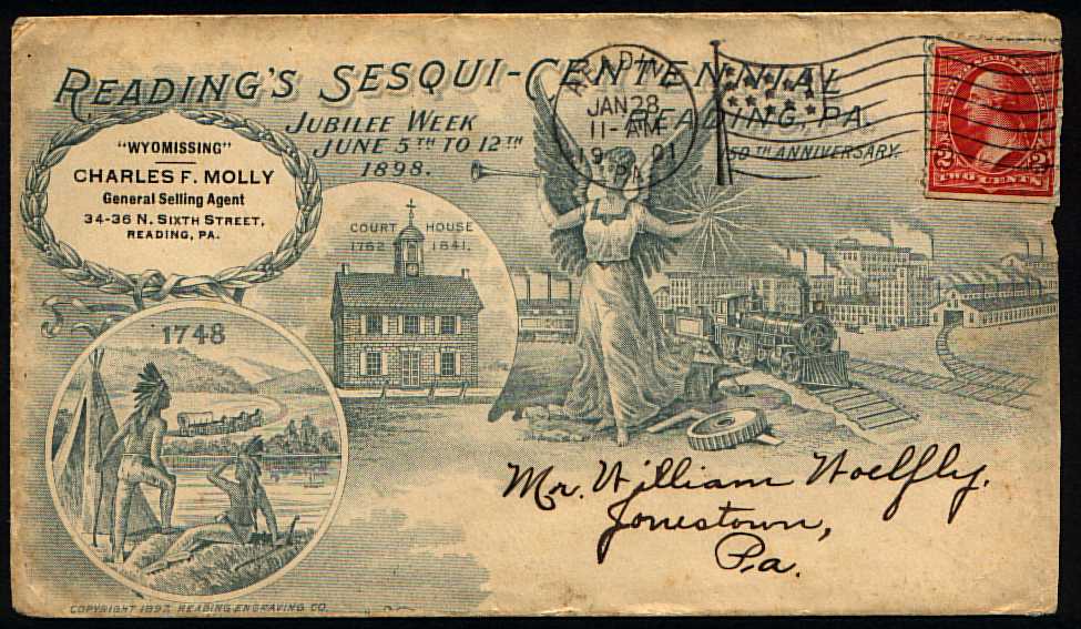
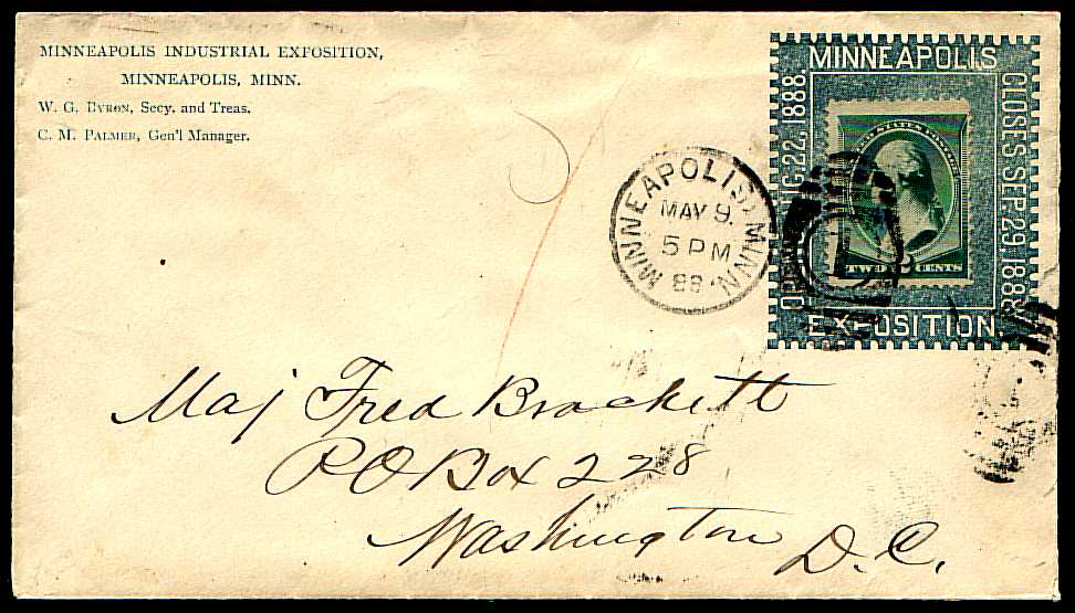
One thing that fascinates me about items as old as these, most nearly a century old, is the picture they provide of life in those times - look at the "REAL ESTATE" cover below, for instance, with its statistics about crop yields in Pierce County, Nebraska in the late 1800's; or the next one, advertising Reading, PA's sesquicentennial in 1901. I like the covers in the second row below because their collars are made to look like stamps, with perforations, so we have a stamp inside a stamp - sort of clever.
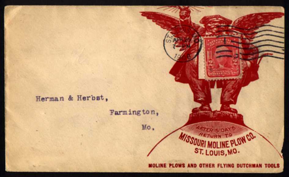
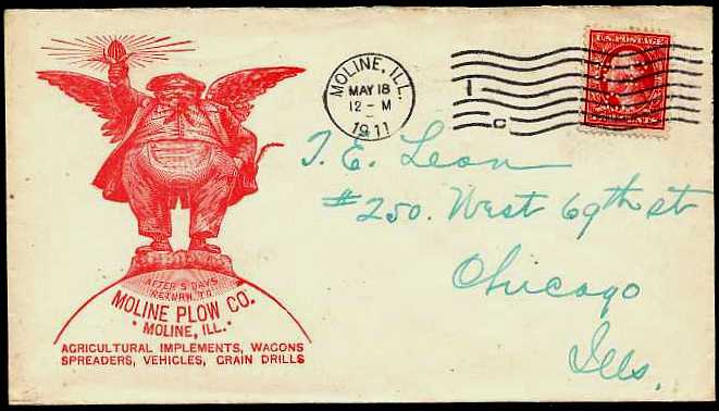
Below are six of the Moline Plow Co. covers, dated from 1897 through 1912. Note that by 1912 they had dropped the collar - was it declared illegal by the USPOD? Or did they decide it was just too much trouble? That last cover does have a nice perfin on it though, with the company's initials - MPCo. And what was the significance of the image (presumably the company's logo), a squat, funny-looking guy with wings, a torch, and an oil can? I've found references to the company as "Flying Dutchman-Moline Plow Co.", so presumably he is the Flying Dutchman, but still....
A search via Google eventually yielded the following
(That paragraph is quoted from the page: http://www.minneapolismolinecollectors.org/articles/articles.html which no longer exists.)Moline Plow was founded in Moline IL in 1865 as Candee, Swan & Company. By 1868, their products, primarily plows, harrows and cultivators, filled a 20 page catalog. MPCo developed a very successful 3-wheel sulky plow in 1884, whose name "Flying Dutchman" became the trademark for all the MPCo products. However, their 'Dutchman' was not the accursed sea captain of the Wagner opera, but a rotund and jolly-looking winged man, in whose upreaching hand was a fine ear of corn.
I wrote the author of the text I quoted above, William Ellis of Moline, IL, to see what more he could tell me, and he added the following:
By the way, the thing in the Dutchman's pocket identified as "an oil can" is actually the stem of his pipe, sticking out of the pocket of his pantaloons. A life-sized Dutchman statue is on display at the Minnesota Historical Society, in their "GrainLand" display. It is also featured on the cover of their museum promotional literature. Later versions of the Dutchman show him having lost a little weight and a happier face. In earlier depictions, such as the covers you show, he really looks like a gargoyle!
MPCo was acquired by and merged with other companies over the years, becoming first the Moline Implement Company, then part of the Minneapolis Moline Power Implement Company, then part of White Motor Company. What remains of it today is part of AGCO, a farm machinery conglomerate.
NOT A COLLAR? |
---------------------
FOREIGN ADVERTISING COLLARS
Advertising collars were used in other countries besides America. I don't own any examples, but I have accumulated images of an assortment of those from eBay and other Internet sources. CLICK HERE for a page of those images.
---------------------
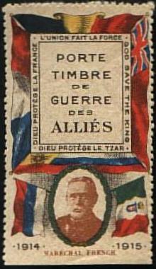
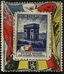
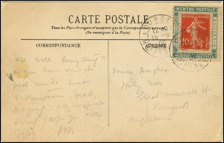
PORTE TIMBRES
Another variation on the theme is the "Porte Timbre," which is French for "stamp carrier." This is a label such as the three below.
Instead of printing the collar on the envelope, it was printed on a label, to which a stamp could be applied, and the combined label was stuck to the envelope in the usual place.
If you got to this page via the link on my "A is for Advertising Covers" page, close this window to return to its parent.
Otherwise, follow one of the links below.
| Home | A is for Advertising Cover <<< | Contents | >>> B is for Bisect | Credits |
All text Copyright © 2003, William M. Senkus
Send feedback to the webmaster: CLICK HERE
Created -- 05/01/2000
Revised -- 07/27/2025
