

A is for Advertising Cover |
 |
 |
 |
 |

An Advertising Cover is any postally-used envelope with advertising printed on it.
Today we call this sort of thing "junk mail", because we get so much of it; but a century ago, when a visit from the postman was still an event, an eye-catching piece of mail had more impact. Businesses dressed up their envelopes - back as well as front - with elaborate, colorful images. They provide a glimpse of the culture, commerce, and design of their era.
Modern collectors love them, and while most are inexpensive, some can be costly, an example of the maxim that one era's trash is another's treasure.
Note that stamp collectors use the word "cover" to mean any envelope that has been through the mails, so presumably it has an address, a stamp, and postal markings.
Another word for an envelope with postage on it, used or unused, is "entire" (usually applied to postal stationery, but sometimes any envelope); while a part of an envelope with cancelled stamps still affixed is a "piece".
Click on any image below to view a high-res version
Corner Cards


Corner cards, the earliest type of advertising cover adornment, were initially simply a preprinted return address, but they grew more elaborate and decorative as the use of envelopes grew. The name implies to me that these originated as an offshoot of business cards. The two examples shown above are from the 1850's (that's when the stamp, Scott #11, was in use).
There are cases (see this page, for example), where corner cards actually represented payment of fees, i.e. were a form of franking, though some might say I'm stretching the term too far in those instances.
It may seem strange that business cards should have developed BEFORE envelopes, but in fact envelopes were rarely used prior to the US postal reforms of the 1840's. Prior to that time, postal rates were based on the number of sheets of paper, and an envelope would have been considered an extra sheet. So most mail was sent as "folded letter sheets", and those letter sheets were often quite large - I have one that measures 14" x 22", and was folded in quarters, then filled with closely-written text on both sides of every one of the 4 "pages" (each 7" x 11")thus created. Apparently there was no limitation on how large a sheet could be.
In 1847, the U.S. revised postal charges, lowering them dramatically, and changing to weight-based rates, thereby making envelopes for the first time a practical concept in this country. Folded letters continued to be used for a few years, but as rates fell even further, and the cost of sending a letter came within the reach of almost every citizen, they lost their appeal. In 1849 the first envelope-making machine was patented in the U.S., and soon after envelopes became the standard vehicle for mail.
The National Postal Museum in Washington, DC has among its many excellent exhibits a fascinating one titled "The Evolution of the American Envelope", including models of six early envelope-making machines.
Cameos


Cameos, which originated a bit later than, and are considered a subset of corner cards, are often embossed, are usually oval or shield- shaped, and are almost always dark blue or black (WHY? One explanation that occurs to me is that something about the way they were produced dictated the color. I would welcome further information on the topic). The name, obviously, comes from the resemblance they bear, both in design and use of embossing, to cameo jewelry, which was popular at the time. Both of these examples are from the 1850's as well. The one on the left is a "stampless cover". The "PAID/3" handstamp shows that it was prepaid - prepayment of mail became mandatory in the US only in 1855, whereas the use of stamps to prove that prepayment did not become a requirement until 1856.
Advertising Collars

The number of different advertising covers out there is formidable, and many collectors specialize in a specific type, such as Advertising Collars, on which the design was intended to frame the stamp. These are not as common as one might suppose, perhaps because they don't work well unless the stamp is perfectly placed. It may also be that they were outlawed by the Post Office at some point, at least I have this vague memory of reading that somewhere. The cover above, a popular design from the Moline Plow Co., is a personal favorite and one of the most striking of the stamp collars. It can be found in several different versions (see link at bottom of this section). This one is an early one, dated 1899.


Some advertising collars were printed on postal stationery. The advertising was printed by the same firm that produced the envelopes, and at the same time, which obviously circumvented the difficulty of centering the postage in the collar, and allowed an integrated design that combines the "stamp" and collar in an artistic, attractive fashion. The three above all date from about 1885. Note that these are mint entires - most advertising covers are collected used, since that is the only way they are found. How did these come to be available mint? Their price - $250 each! - implies they are not common thus.
Below is a POSTCARD with a decorative (rather than advertising) stamp collar, and a mailbox on the picture side. It dates from the early years of postcards, when the address side could contain ONLY the address (it was 1907 before messages were permitted on the address side of postcards), so the red mailbox on this one has a hinged flap, and beneath that is a little pocket into which a small piece of paper with a message could be slipped. Mine has lost its enclosure, but is still a treasured part of my collection, both for its collar and for its clever device.


If you would like to see more advertising collar covers, including a series of six from the Moline Plow Co, click here.
---------------------
FOREIGN STAMP COLLARS
Advertising collars were used in other countries besides America. I don't own any examples, but I have accumulated images of an assortment of those from eBay and other Internet sources. CLICK HERE for a page of those images.
---------------------
PORTE TIMBRES
Another variation on the theme is the "Porte Timbre," which is French for "stamp carrier." This is a label such as the three below.
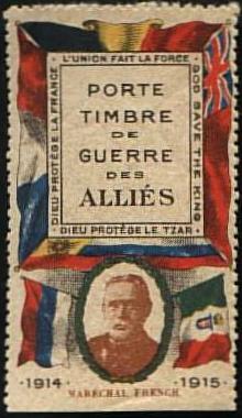
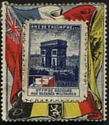

Instead of printing the collar on the envelope, it was printed on a label, to which a stamp could be applied, and the combined label was stuck to the envelope in the usual place.
The pinnacle:
Seabury & Johnson


By the turn of the century, advertising covers had become fabulously elaborate, with multi-colored trompe l'oeil designs covering both sides of the envelope. Here is one of the most avidly sought, the Seabury & Johnson cover. Note that it even incorporates a stamp collar into the design.
The cover above is the only S & J cover I actually own, and I was able to buy it for a reasonable price - about $100 - since it has been shortened by at least half an inch at the left side. You'll have to pay $500 and up for a complete one.If you want to see more, here's a page with scans of photos of S & J covers from auction catalogs, including as well the text of a very interesting personal letter written on their stationery in 1898.
And if you'd like to know a little more about the company that produced these fabulous covers,
click here.
Hotels and Buildings


Hotel advertisements are one of the larger sub-species of advertising covers. They can be found in most of the types described above (corner cards, cameos, collars), plus ones such as these, with engraved illustrations of the hotels. Both of these are dated 1890.
Topical Advertising Covers


Topical collecting of advertising covers (see "T is for Topical") is also popular - my own favorite topic is trains - the three above are among my favorites. Technically the middle one is a Private Express Cover, and the advertising is part of the franking, but I'm including it here anyway. (If you'd like to see more trains, check out my pages of Trains On U.S. Stamps, Trains On Advertising Covers, and Trains On Collins FDCs.


Or how about coffee and tea? The first cover, on the left above, contains a hand- written (?) advertising letter, reproduced here. Is it really handwritten, or is this just an early example of the phony "personal touch" still so popular with modern mail advertisers such as Publishers Clearing House? The third cover, for Tetley tea, provides me an excuse to show you the charming 1905 Tetley Tea advertising pamphlet reproduced here
Four times Nothing = Something?

I bought this cover for the treacly, old-fashioned verse it carries, and hardly noticed the stamps - they added a sense of authenticity, but since I paid only $10 or $15 for it, I assumed they were worthless. What a mess!
Then recently I actually looked at the cover closely for the first time, and realized what a silly piece of fakery it is. In the first place, the total postage adds up to 43c, which is ridiculous for a letter mailed a hundred miles or so within the US about 1873(?). The domestic first class rate at that time was 3c per half ounce, period, and there are no indications of special services - besides Registration was the only one available at the time, and would have cost 15c, period.
Furthermore, looking at the stamps, a 3c Sc. 65 (1862), a 10c SC. 68 (1862), and a 30c(!) Sc.165 (1873) - none of them is tied to the cover, and only the 3c is cancelled in such a way as to make that possible. So I doubt either of the higher-value stamps on it actually carried it through the mails - apparently they were moved here after doing hazardous duty elsewhere. But why would someone bother to put them here? Neither adds any real value - despite their catalog value of $130, their condition is so poor that off this envelope they would hardly even qualify as space fillers and on it they are just puzzling.
Then again, I might not have bought this at all without all that intriguing postage. So perhaps my title to this item is true - a clever ruse converted four worthless items - three stamps and a ratty old cover - into something of value.
Fairs and Expos


Fairs and Expositions are another popular topic, combining historical interest, nostalgia, and thematic unity.
DRAMA


The appeal of some advertising covers is simply their dramatic imagery, an eye- catching design that makes one want to know more. The three above certainly fall into that category - don't you want to know "What's going on here?" That's the secret of any successful ad - it makes you want to know more.
Other Favorites


Many companies produced advertising covers over several decades, and modified their designs as style and fortunes changed. Two of my favorites are Longman and Martinez Paint Company and International Stock Food Company.
The Author Pontificates
How did Advertising Covers originate? And why did they develop when they did? One might argue that they were an inevitable development in our capitalist, market-driven economy in the latter part of the 19th century, long before radio or TV, as mail evolved from what had been an expensive tool of the privileged to become the prime means of communication among ordinary people. As soon as the first person had the inspiration of putting some sort of advertising on his business envelopes, it wouldn't have been long before others followed, and as production methods evolved and became cheaper, the style of advertising would naturally tend towards more colorful, eye-catching designs.
The antecedents of advertising covers clearly include the business cards, illustrated trade cards and illustrated stationery of the early part of the 19th century. Indeed, advertising covers almost certainly would have developed earlier, had envelopes been widely used, but the expensive "per page" postal rates in the US prior to the 1840's made the use of envelopes an impractical luxury. When the US - following the lead of Great Britain - adopted lower, weight-based postal rates, envelopes immediately gained popularity. Notably, the first envelope-making machine was patented in the US in 1849.
Some people credit the Mulready Envelope (see "M is for Mulready") as the source of the concept that produced Advertising Covers. Certainly the Mulready was the first example of a widely-distributed envelope with an ornate design; and the many very popular parodies it inspired, as well as the development of hand-decorated envelopes that followed, could easily have led some enterprising businessman to think of envelopes as a natural medium for advertising. On the other hand, advertising covers developed and thrived not only in Great Britain, where the Mulready was produced, but also in the US, where it was probably little known.
There is no way to say for sure which influences were most important in the development of advertising covers - like many such debates, I think the value of this one is in the questions it leads us to ask, and the avenues of study it leads us to pursue, rather than the hope of a certain answer.
Patriotic Covers


One clear forerunner of multi-colored advertising covers in the US was the patriotic envelopes of the US Civil War. Flags and other military insignia were a logical adornment to mail in a time of great patriotic fervor. Their example presumably inspired other sorts of advertising once the war had ended. (Note that the cover on the bottom left has no stamp, just the inscription "SoldiersLetter", indicating that it was sent by a soldier on active duty, in this case in the Union Army. It has been the rule since at least the time of the Civil War that military personnel send mail free of charge - see "W is for War")
Modern Advertising Covers


Will today's junk mail ever have similar interest and value? I wouldn't be surprised - just take a look at all the once-cheap and plentiful souvenirs and ephemera for sale on ebay, or being appraised at fantastic sums on "Antiques Roadshow", if you doubt the power of time, nostalgia and scarcity to impart value. Few of us save any of the endless stream of ads from Publishers Clearing House, but while most bear only permit imprints, they are still attractive and interesting examples of our modern culture. I toss out most of them myself, but save one occasionally if it is especially attractive or entertaining. The item above has both the canoe on the stamp, and the sailing ship on the back to give it a solid nautical theme, and is attractively produced. Its one drawback is its size, about 6x10inches.


The key is in saving something that no one else does, and in keeping it in mint condition. Sometimes it helps to save things that create a larger picture as well, such as a series of items that show development or variations, or that tell a story. If you make it interesting to yourself, it will probably be interesting to someone a hundred years from now as well. Your grandchildren may thank you some day for saving a box or two of your "worthless" junk mail.
REFERENCES
During the 1970's a collector named John R. Biddle formed what may still be the most extensive and varied collection to date of the advertising covers of the US and Canada. He then earned our great respect and gratitude by publishing the highlights of his collections as The American Illustrated Cover Catalog, which is still the primary reference on the topic. I am indebted to that publication for much of the information in this article.I would like to thank Phil Bansner (who has an excellent web site) for permitting me to reproduce covers from his stock.
| Home | Introduction <<< | Contents | >>> A is for Advertising Collars | Credits |
All Letter images Copyright © 1997, 2000, SF chapter of AIGA
All text Copyright © 2000, William M. Senkus
Send feedback to the webmaster: CLICK HERE
Created -- 05/01/2000
Revised -- 08/05/2025